Creating a Cover, AMERICAN VAMPIRE #3
Coming up with a cool cover is hard. Rafael Albuquerque made things a little easier with AMERICAN VAMPIRE because he had the simple but brilliant idea of cutting the layout in half with the logo—two stories, two scenes, united by the logo. But it still takes a little work to make things perfect.
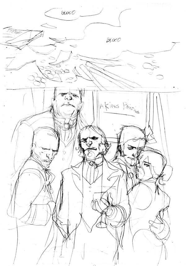
Rafael’s first sketch was a detail of a shop floor, covered in candy and blood, and a portrait of a sophisticated European vampire family on the bottom.
 We really loved the floor detail, the juxtaposition of candy and blood is just sickly weird. And the Eruo fam was cool, but we liked that sexy couple in the back, Bernard and Lucia, and since they figure prominently in this issue we wanted to bring them to the front.
So Rafael did another sketch.
 He brought our Euro-vamp lovers to the front (sort of echoes a certain, popular, tween vamp movie, no?) and included another idea for the top part. That’s Skinner relieving himself on the Mayor’s doorstep, shadows of two cops surrounding him. We thought that was a little much. Even for a Vertigo cover. Back to the candy and the blood and the floor. But we were still missing a final detail…
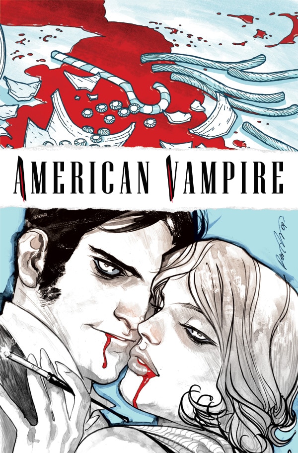
Rafael went back to the candy and blood, kept Bernard and Lucia front and center, then just added that last, final detail—the cigarette holder—the quintessential accessory for all those Jazz Age girls—even vampires.
 Now we have blood, candy, and a sexy vampire couple clearly set in the ‘20’s. Perfect. All you have to do now is read the issue and find out what it all means!


Editorial
From the Editor's Desk: Mark Doyle--Creating a Cover, American Vampire #3
BY: DCE Editorial
Wednesday, May 19th, 2010


