As Peter Gross mentioned in THE UNWRITTEN METHOD, he sometimes gets a little help. In issue #24 of THE UNWRITTEN (on sale this today) Al Davison is the artist on finishes. Below, Al gives us a look at his process. Enjoy.
 Mike Carey and I have known each other for many years, and we have been looking for an opportunity to work together ever since we met. I've also been a fan of Peter's work since first reading Lucifer. So when Mike introduced me to Pornsak at the Birmingham International comics show, and suggested the idea of my providing finishes for an issue of THE UNWRITTEN I jumped at the chance.
The issue I was to work on turned out to be a sequel to the wonderful Willowbank Tales from issue #12, with gorgeous finishes by Kurt Huggins and Zelda Devon.
When I read Mike's script it was clear things were going to get even darker and more twisted. Pornsak knew that I was a bit of a chameleon art wise, so asked me to come up with some sample styles that would suit the nature of the story, but keep an element of 'the cute'.To my amazement the first sample I submitted did the trick. Kurt and Zelda's work was kind of Beatrix Potter via Ivan Biliban, this was more Arthur Rackam via Ralph Steadman!
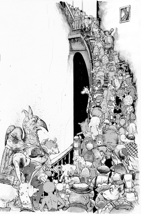
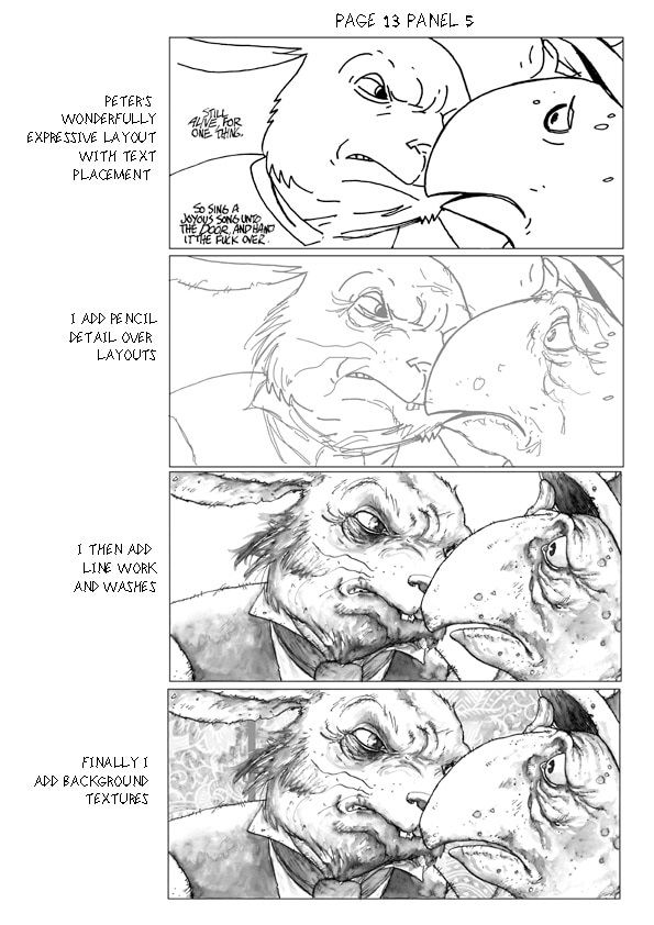
 The next step was getting to grips with Peter's layouts... I 'd never done finishes over someone else's layouts before, and wasn't sure what to expect, how much detail they'd have, or how tight they'd be. We had already discussed my preferred approach, so Peter sent me digital files that I could print out on to an art paper that suited the techniques I'd be using (acrylic ink. watercolor and lots of splatter!) When the pages started arriving I couldn't have been happier. There was enough detail for me to be clear on the emotions and body language that Peter had in mind for the main characters, but they were loose enough to give me room to play as well. On page 2 in particular, Peter’s layout suggested certain characters, but allowed me to research and draw most of the characters myself.
 After adding detail with pencil where needed, I then took out my trusty Waverly dip pen and started inking the line work. This pen has been in my family since the late 1890's, and I'm still using the original nib and holder! I inked the stronger outlines first and let them dry, then I inked in the detail, but before the ink had fully dried I add washes using lamp black watercolor, this allowed line work within the main outline to bleed, and helped give a more modeled look. After it had dried I went back and added in sharper lines where needed.
 The next stage was to produce a series of encaustic paintings, these were created by applying pigmented waxes to a hot iron and applying this to smooth card, the melted wax creates various organic textures depending how you lift the iron off the card, that are great for rocks and other organic forms.
 These paintings were then scanned along with the line and wash art. I then applied these textures to the line art in Photoshop, along with other textures and patterns (in this case wallpaper mostly). The textures were kept on a separate layer, to allow the colorist more flexibility and the art was then saved as a grey-scale file.
Pornsak, Joe, Mike and Peter would then check the pages for errors (Mr bun's sword in the wrong hand, oops!) And suggest revisions until we were all happy with the result. It was then the turn of Chris Chuckry and Todd Klein to work their magic on the colors and lettering respectively.
It's been great fun working on this book, as well as an honour. I couldn't wish for a better team of collaborators. Thanks again for giving me the chance to work on one of the most thought-provoking and intriguing books out there.
--Al Davison


Editorial
The art of The Unwritten #24 by Al Davison
BY: DCE Editorial
Wednesday, April 13th, 2011


